MapView®
MapView® is Persium’s public-facing digital twin and map-based visualisation platform, designed to make air quality data understandable, actionable, and shareable, at neighbourhood, city, and global scale.
It combines real-time sensor data, spatial context, and health guidance in a single interactive map experience.

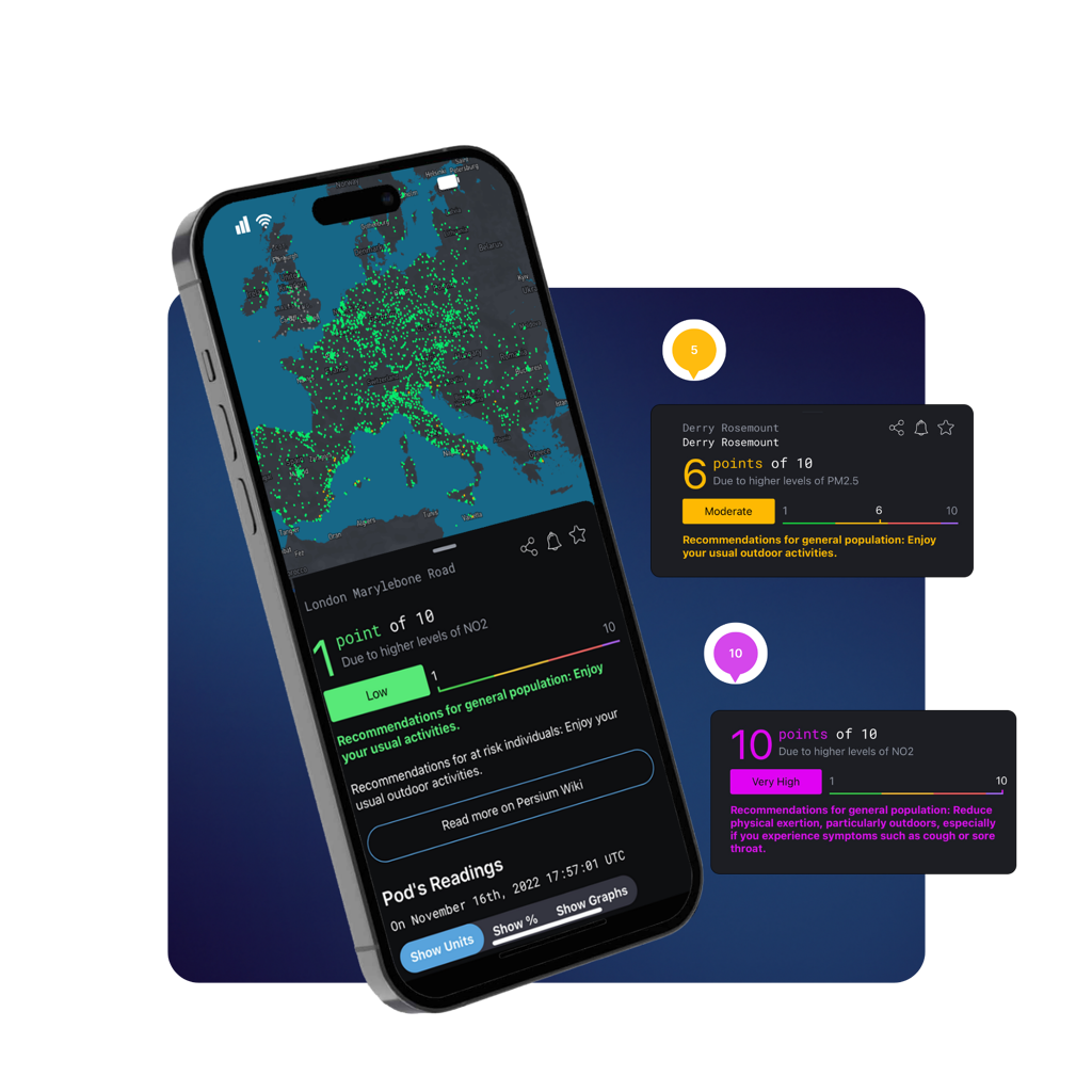
✓ A free-to-use air quality information resource via an intuitive world map display.
✓ Share data & forecasts to protect local communities and build awareness.
✓ Choose your favourite local air quality stations to stay updated.
✓ Turn on notifications to be notified.
What MapView® Delivers
MapView provides access to real-time and historical air quality data through an intuitive world map interface.
Displays live data from 5,000+ air quality stations globally
Updates at least hourly, depending on deployment
Presents data as concentrations (µg/m³, ppm, ppb) and simplified AQI
Enables users to follow favourite local monitoring stations
This makes MapView suitable for both public awareness and professional use.
MapView extends beyond maps into 3D digital twinning, allowing users to visualise air quality data within real-world environments.
View deployed Persium Pods in 3D spatial context
Explore simulations of buildings and infrastructure (e.g. landmark deployments)
Understand how air quality varies across height, location, and surroundings
For organisations, this enables deeper insight into exposure, dispersion, and environmental behaviour.
MapView helps translate air quality data into clear health-relevant information.
Health recommendations aligned with WHO and local air quality standards
AQI-based guidance designed for public understanding
Supports community awareness and risk communication
This makes MapView a powerful tool for cities, councils, and public-facing programmes.
MapView also provides visibility into sensor health and network integrity.
Component-level health status across temperature, pressure, humidity, gas, PM, wind sensors, and battery
Orientation data including pitch, roll, and alignment, helping identify potential vandalism or tampering
Clear diagnostics to support maintenance and data reliability
This ensures users can trust both the data and the infrastructure behind it.
MapView is designed to be shared widely and integrated easily.
Share real-time and historical air quality data with communities, teams, and stakeholders
Embed MapView directly into websites and public dashboards via API
Support transparency initiatives and public reporting
This makes MapView ideal for smart cities, public health portals, and community platforms.
MapView® Digital Twinning
MapView enables 3D digital twin simulations, such as a detailed model of The Shard with a Persium Pod deployed on London Bridge Pier, shown alongside real-world imagery. Users can view their own installed Pods within a spatial 3D environment and interact with simulations to explore how air quality behaves across location, height, and time.

Frequently Asked Questions
MapView® incorporates 3D digital twin visualisations to place air quality data within real-world environments such as buildings, streets, and infrastructure. Persium Pods can be viewed in spatial context, allowing users to explore how air quality varies by location, height, and surrounding structures.
This makes complex environments easier to interpret and helps translate data into visual insight.
By visualising air quality data alongside environmental context, MapView® helps users explore how pollution changes and moves over time. When combined with wind and temporal data, the map makes it easier to interpret trends, recurring patterns, and directional behaviour.
This supports clearer communication and more informed analysis, without requiring specialist modelling tools.
MapView® uses dynamic heatmaps and computational analysis to visualise how air pollution builds up, disperses, and changes over time across an area. These heatmaps highlight concentration gradients rather than single points, making it easier to identify hotspots, corridors, and patterns of exposure.
When combined with 3D digital environments and environmental context, this computational approach helps illustrate airflow behaviour and pollution movement, supporting clearer interpretation of dispersion and environmental dynamics without requiring specialist modelling expertise.
By combining maps, heatmaps, and 3D digital environments, MapView® helps translate complex air quality data into insight that is easier to understand and communicate. This supports:
Evidence-based planning and policy discussions
Clearer communication with stakeholders and the public
Better understanding of local exposure and environmental risk
MapView® bridges the gap between raw data and real-world understanding.


